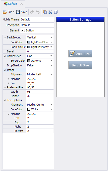
Themes: Button

This sets the themes for the Button control.
The properties provided are: BackGround, Bevel, BorderStyle, DropShadow, Image, PreferredSize, and TextOptions.
In most cases, the button control's size will be dictated if placed in a Layout control on the form or page. However, if its placed on a Form or Page directly, the Preferred Size is used to set the button width and height. All the other properties are used the same as the other controls.
See Graphical Control Property Definitions for descriptions of the properties.